Hayday
2025 • finance app design • UX/UI design lead
Summary
Hayday are set to position themselves as the only app truly offering a real all-in-one personal finance and budgeting experience. Initial research suggests many financial apps are over-complicated and disparate. Existing branding and typography was supplied, with the expectation to build a scalable design system within Figma
Tools
Figma, Adobe CC
Deliverables
Basic wireframes, followed by Figma prototype for mobile app (including components and design system)
Timescale
10 days
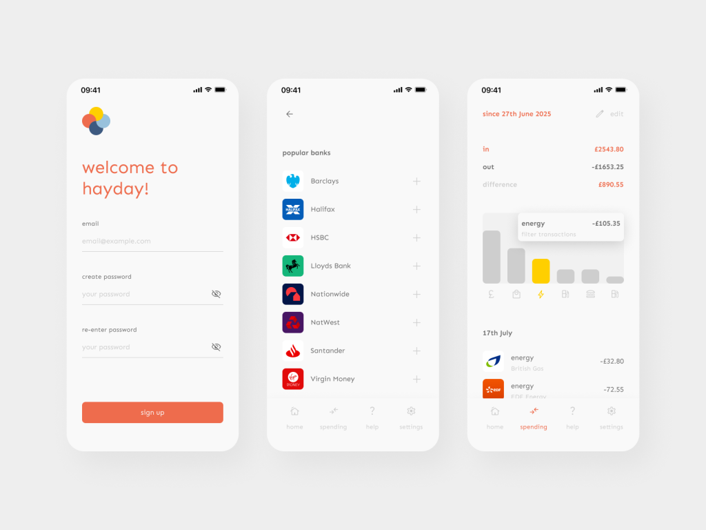
Login, Add Account & Spending screens
Discovery & Design
The overall design direction was ‘clean’, ‘uncluttered’ and ‘consistent’. With the topic being one of infinite complexity, distilling the interactions to those which were strictly necessary was the main starting point. Competitor analysis was undertaken, with an emphasis on noting the most common elements (and sticking points)
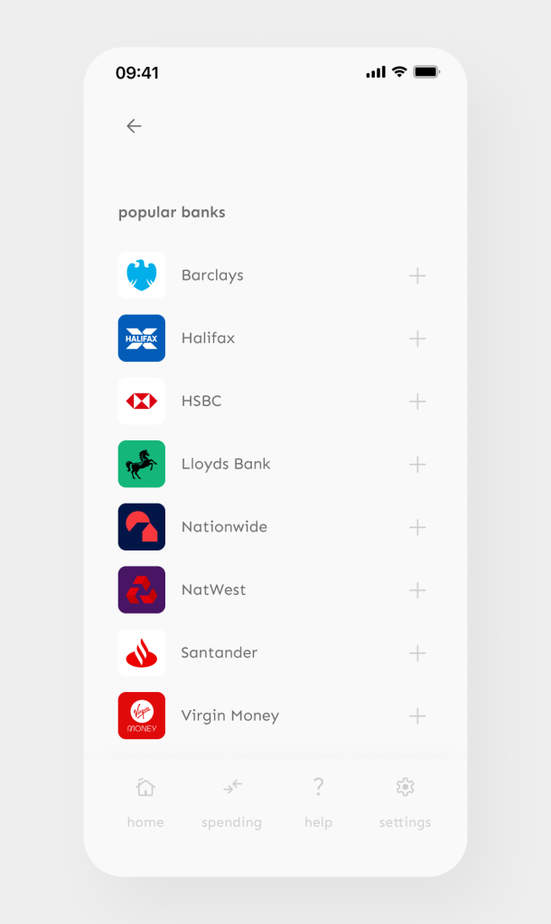
Add Account screen
Challenges
By necessity, a unique challenge was to strip out all unnecessary details from the user experience. By incorporating the user’s existing banking apps, ‘hiding’ information and introducing pleasing micro-interactions, we were able to make the app quick and easy to use
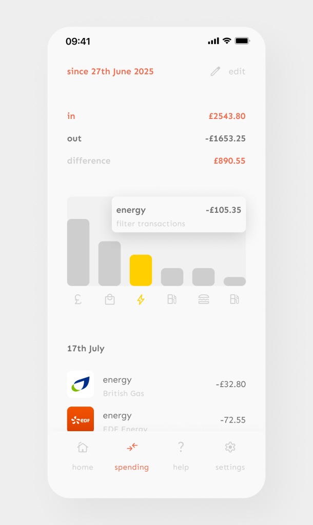
Spending screen
Outcome
In total, 11 screens were produced to show the overall design direction and to demonstrate the animation properties of the micro-interactions. As the project develops, the client has suggested mapping more user flows for app to highlight new features and to provide their dev team with more clarity
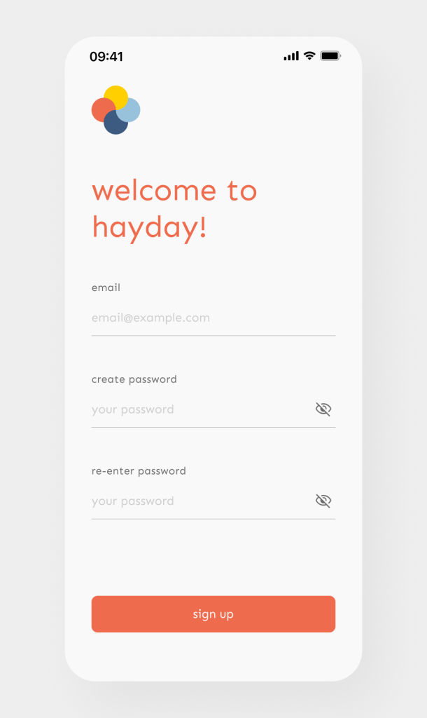
Sign Up screen